Data visualization: Understanding its crucial importance:
Data visualization is the graphical representation of information and data. By using visual elements like charts, graphs, and maps, data visualization tools provide an accessible way to see and understand trends, outliers, and patterns in data. The primary goal is to communicate information clearly and efficiently to users through graphical means.
- Revealing Trends in Data:
- One of the key functions of data visualization is its ability to uncover trends in the data. When data is displayed visually, it becomes easier to identify patterns and trends compared to examining data in tabular form. For instance, visualizing sales data using a tool like Tableau can reveal customer behavior, showing both high sales and associated losses or profits through color coding. Such insights might be challenging to discern from a standard table.
- Better Decision Making:
- Visual data allows decision-makers to understand analytics visually, leading to faster and more informed decisions. It supports the identification of areas that need attention or improvement, helps in predicting trends, and facilitates comparing different sets of data.
- Providing Perspective on Data:
- Data visualization offers a broader perspective on the data by highlighting its significance within a larger context. It shows how individual data points relate to the overall dataset. For example, visualizations comparing sales and profits can highlight that higher sales don’t always equate to higher profits, giving a clear perspective that would be difficult to achieve from raw numbers alone.
- Contextualizing Data:
- Understanding the context of data is crucial, and data visualization makes this possible by presenting the data within its full circumstances. For instance, a TreeMap can effectively show regional sales data, making it immediately apparent which region has the highest sales. Without visualization, grasping such contextual information from a list of numbers is far more challenging.
- Saving Time:
- Data visualization significantly reduces the time needed to interpret data. Insights can be quickly gathered from visual representations rather than sifting through extensive charts or tables. For example, a heat map can instantly highlight areas of loss by color-coding them, saving time that would otherwise be spent manually checking each value in a table.
- Communication:
- Effective data visualization helps communicate complex data insights clearly and engagingly. It is crucial for storytelling with data, as it enables presenting data-driven insights in a compelling and easily digestible format.
- Exploration:
- Data visualization aids in exploring large datasets. Interactive visualizations allow users to drill down into specifics and see data from different perspectives. It helps in identifying anomalies and discovering hidden patterns within the data.
- Telling a Data Story:
- Beyond just presenting data, visualization tells a compelling story. It transforms data points into a narrative that is easy to understand and follow, leading viewers to logical conclusions. For instance, a data analyst might use visualizations to narrate the performance of various products, starting with overall profits and losses and ending with strategic recommendations to address any issues. This storytelling aspect makes data more engaging and impactful.
- Engagement:
- Visual data is often more engaging and easier to retain, making it a valuable tool for presentations and reports. It captures the audience’s attention and helps in better conveying the message.

Data Visualization: History and Evolution Overview
The history and evolution of data visualization date back to ancient times, with the earliest known examples being used by the Egyptians to assist in navigation and record information on walls and papyrus. Over centuries, the development of statistical graphics continued, leading to significant advancements during the Enlightenment when William Playfair pioneered the use of bar charts, line graphs, and pie charts in the late 18th century.
The 19th century saw further progress with Florence Nightingale using statistical graphics to highlight mortality causes during the Crimean War, thus influencing public health policies. Edward Tufte’s work in the 20th century, particularly his book “The Visual Display of Quantitative Information,” revolutionized the field by emphasizing the importance of clarity and efficiency in data presentation.
Today, data visualization has evolved into a critical component of data analysis and decision-making, leveraging sophisticated software and interactive tools to transform complex data sets into accessible visual formats, enabling real-time insights and driving strategic actions across various industries.
Types of Data Visualizations
- Charts and Graphs
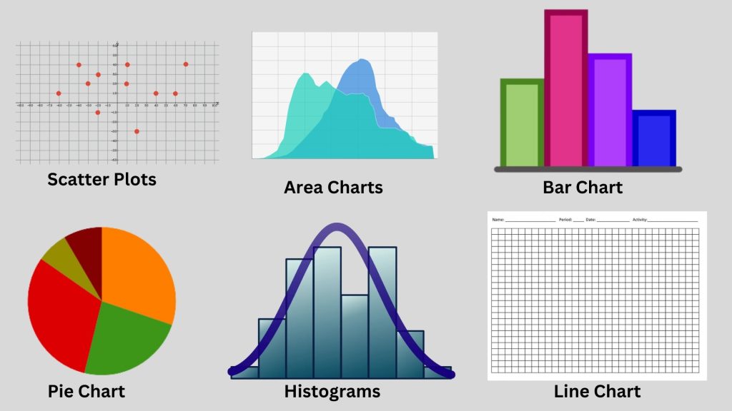
- Bar Charts: Used to compare different categories of data, with rectangular bars representing the magnitude of each category.
- Line Charts: Ideal for showing trends over time, with points connected by lines to display the progression of data.
- Pie Charts: Represent parts of a whole, with slices of the pie showing the proportion of each category.
- Scatter Plots: Used to display the relationship between two variables, with points plotted on a two-dimensional axis.
- Histograms: Show the distribution of a dataset, with bars representing the frequency of data points within certain ranges.
- Area Charts: Similar to line charts but with the area below the line filled in, used to show cumulative totals over time.
- Advanced Visualizations
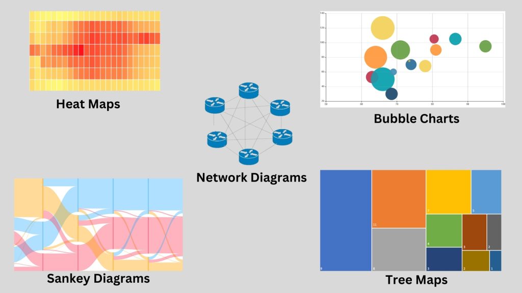
- Heat Maps: Use color to represent data density or magnitude, useful for displaying data over geographical areas or matrices.
- Tree Maps: Display hierarchical data as a set of nested rectangles, with the size of each rectangle representing the quantity of data.
- Bubble Charts: Extend scatter plots by adding a third variable, represented by the size of the bubbles.
- Network Diagrams: Illustrate relationships and flows between different nodes, useful in showing connections within networks.
- Sankey Diagrams: Visualize the flow of quantities through a system, highlighting the major transfers and losses.
- Interactive Visualizations
- Dashboards: Consolidate multiple data visualizations into a single interactive interface, allowing users to explore and drill down into data.
- Real-Time Data Visualizations: Update live to reflect the most current data, essential for monitoring ongoing processes and making timely decisions.
Tools and Software for Data Visualization
- Open Source Tools
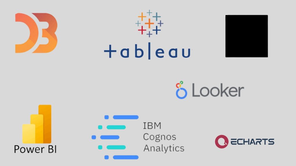
- D3.js: A JavaScript library for producing dynamic, interactive data visualizations in web browsers. It uses HTML, SVG, and CSS to create visual representations of data, allowing for extensive customization and flexibility.
- ECharts: A powerful charting and visualization library built on JavaScript and ZRender. It is highly customizable, supports a variety of chart types, and is particularly useful for creating interactive and intuitive data visualizations.
- Vega: A visualization grammar, providing a high-level language for creating, sharing, and exploring visualizations. It allows users to design complex visualizations and generates graphics using web standards like SVG and HTML5 Canvas.
- deck.gl: Developed by Uber, this is a WebGL-powered framework for visual exploratory data analysis. It helps build high-performance visualizations of large datasets, particularly useful for geospatial data analysis.
- Commercial Tools
- Tableau: A leading commercial data visualization tool known for its powerful and user-friendly interface. It supports a wide range of data sources and allows users to create a variety of interactive and shareable dashboards.
- Microsoft Power BI: A suite of business analytics tools that deliver insights throughout an organization. It allows for the creation of reports and dashboards that can be shared and accessed on various devices.
- IBM Cognos Analytics: An integrated business intelligence suite that provides a range of tools for reporting, analysis, scorecarding, and monitoring of events and metrics. It includes advanced data visualization capabilities to support data-driven decision-making.
- Looker: A data platform that offers powerful tools for business intelligence, including data visualization, exploration, and analysis. It integrates seamlessly with various data sources and provides interactive dashboards and visualizations.
Data Visualization Techniques and Best Practices
- Choosing the Right Visualization: Selecting the appropriate type of visualization depends on the data and the message you want to convey:
- Bar Charts for comparing different categories.
- Line Charts for showing trends over time.
- Pie Charts for displaying parts of a whole.
- Scatter Plots for illustrating relationships between variables.
- Heat Maps for showing data density or intensity
- Designing for Clarity and Impact: Clarity is crucial in data visualization to avoid misinterpretation:
- Simplify Your Visuals: Avoid clutter by removing unnecessary elements.
- Use Clear Labels and Legends: Ensure all elements are well-labeled and legends are concise.
- Focus on Key Data Points: Highlight the most important data to draw attention
- Avoiding Common Pitfalls: Common mistakes can undermine the effectiveness of data visualizations:
- Overloading with Information: Avoid putting too much information in one chart, which can overwhelm the viewer.
- Misleading Scales: Ensure axes are correctly scaled to accurately represent the data.
- Improper Use of 3D: 3D effects can distort data perception and should be used sparingly
- Effective Use of Colors and Legends: Colors and legends play a significant role in making visualizations understandable:
- Use Color to Enhance, Not Distract: Use a color palette that is pleasing and consistent, avoiding excessive use of bright colors.
- Color Blind-Friendly Palettes: Consider accessibility by using color schemes that are distinguishable by color-blind individuals.
- Consistent Legends: Legends should be easy to interpret and placed in a logical position
- Simplifying Complex Data: Simplifying complex data helps in better understanding and communication:
- Aggregate Data: Group data into categories or summaries to provide a clearer picture.
- Interactive Elements: Use interactive dashboards that allow users to drill down into more detailed data as needed.
- Focus on Insights: Present the most critical insights and allow the audience to explore deeper data if they choose
Data Visualization Applications
- Business Intelligence
- Dashboarding: Creating interactive dashboards to provide a snapshot of key performance indicators (KPIs) and metrics.
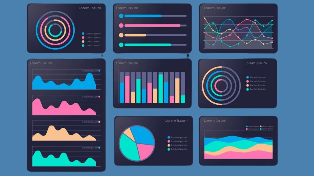
- Trend Analysis: Visualizing trends over time to identify patterns and insights in business data.
- Ad Hoc Reporting: Generating customizable reports for specific business questions or needs.
- Predictive Analytics
- Model Evaluation: Visualizing the performance of predictive models to understand their accuracy and effectiveness.
- Feature Importance: Graphically representing the importance of different features in predictive models.
- Forecasting: Using visualizations to communicate projected trends and outcomes based on predictive models.
- Marketing and Sales
- Customer Segmentation: Visualizing customer data to identify segments and target specific demographics.
- Sales Funnel Analysis: Creating funnel visualizations to track the customer journey from lead to conversion.
- Campaign Performance: Visualizing the effectiveness of marketing campaigns and advertising efforts.
- Healthcare
- Clinical Data Analysis: Visualizing patient data to identify trends, patterns, and correlations for diagnosis and treatment.
- Epidemiological Studies: Using visualizations to track the spread of diseases and analyze public health data.
- Healthcare Resource Allocation: Visualizing hospital resources, patient flow, and occupancy rates to optimize resource allocation.
- Social Media Analysis
- Sentiment Analysis: Visualizing sentiment trends across social media platforms to understand public opinion.
- Influencer Identification: Using visualizations to identify key influencers and their impact on social media conversations.
- Content Performance: Visualizing engagement metrics such as likes, shares, and comments to evaluate content performance.
- Geographic Information Systems (GIS)
- Spatial Analysis: Visualizing geographic data to analyze spatial relationships and patterns.
- Mapping: Creating maps to display demographic information, infrastructure, and environmental data.
- Location Intelligence: Using visualizations to make informed decisions based on geographic data, such as site selection or route optimization.
Creating and Interpreting Visualizations
- Data Preparation and Cleaning
- Data Collection: Gather relevant data from various sources such as databases, spreadsheets, or APIs.
- Data Cleaning: Identify and address missing values, outliers, and inconsistencies in the
- Data Transformation: Convert raw data into a format suitable for analysis, such as aggregating, filtering, or encoding categorical variables.
- Building Visualizations
- Selecting the Right Chart Type: Choose appropriate visualization techniques based on the nature of the data and the insights you want to convey (e.g., bar charts, line charts, scatter plots, heatmaps).
- Designing Visual Elements: Customize visual elements such as color, size, and labels to enhance clarity and readability.
- Creating Interactive Features: Incorporate interactivity to allow users to explore the data dynamically (e.g., tooltips, filters, zooming).
- Interpreting Results
- Identifying Patterns and Trends: Analyze the visualizations to identify patterns, trends, and relationships within the data.
- Comparing Data Sets: Compare multiple visualizations or subsets of data to draw insights and make comparisons.
- Detecting Anomalies: Look for outliers or unexpected patterns that may indicate errors or interesting phenomena.
- Communicating Insights
- Storytelling: Develop a narrative around the data to guide viewers through the insights and implications.
- Visual Hierarchy: Organize visualizations in a logical sequence to highlight key findings and guide the viewer’s attention.
- Contextualization: Provide context and background information to help viewers understand the significance of the insights.
- Tailoring to Audience: Adapt the level of detail and technical complexity of the visualizations to suit the needs and expertise of the audience.
Case Studies and Examples
- Business Dashboards
- Case Study: A multinational retail corporation, implemented a business dashboard to monitor key performance indicators (KPIs) across its various departments and regions.
- Example: The dashboard includes visualizations such as sales revenue trends, inventory levels, customer satisfaction scores, and marketing campaign performance metrics. Interactive features allow executives to drill down into specific regions or product categories for deeper analysis.
- Scientific Visualizations
- Case Study: NASA’s Earth Observing System Data and Information System (EOSDIS) utilizes scientific visualizations to analyze and communicate complex environmental data collected from satellites.
- Example: Visualizations depict phenomena such as climate change, deforestation, and sea level rise using satellite imagery, GIS data, and simulation models. These visualizations help scientists and policymakers understand environmental changes and their potential impacts.
- Financial Data Analysis
- Case Study: Investment firm uses financial data analysis visualizations to track market trends, evaluate investment opportunities, and optimize portfolio performance.
- Example: Visualizations include stock price movements, portfolio allocations, risk exposures, and performance benchmarks. Advanced analytics techniques such as Monte Carlo simulations and scenario analysis are used to forecast future returns and assess portfolio risk.
- Marketing Campaign Visualizations
- Case Study: A global consumer goods company, leverages marketing campaign visualizations to monitor the effectiveness of its advertising and promotional efforts.
- Example: Visualizations track key metrics such as website traffic, conversion rates, social media engagement, and return on investment (ROI) for various marketing channels and campaigns. A/B testing and cohort analysis visualizations help optimize campaign strategies and allocation of marketing budgets.
Future Trends in Data Visualization
- Augmented Reality (AR) and Virtual Reality (VR) in Visualization
- Immersive Experiences: AR and VR technologies will enable users to interact with data in immersive 3D environments, providing new perspectives and insights.
- Spatial Data Visualization: AR and VR will facilitate the visualization of spatial data, such as geographic information and architectural designs, in a more intuitive and immersive manner.
- Collaborative Visualization: AR and VR platforms will enable collaborative data exploration and decision-making among remote teams, enhancing communication and collaboration.
- AI and Machine Learning Integration
- Automated Insights: AI and machine learning algorithms will be integrated into data visualization tools to automate insights generation and pattern recognition, allowing users to uncover hidden trends and anomalies more efficiently.
- Personalized Visualizations: AI-powered systems will dynamically generate personalized visualizations tailored to individual user preferences, cognitive styles, and analytical needs.
- Natural Language Interaction: AI-driven natural language processing (NLP) capabilities will enable users to interact with visualizations using voice commands and conversational interfaces, making data exploration more accessible and intuitive.
- Advanced Interaction Techniques
- Gesture Recognition: Advanced interaction techniques, such as gesture recognition and haptic feedback, will enable users to manipulate and explore data using natural gestures and movements.
- Touchless Interfaces: Touchless interfaces leveraging technologies like depth-sensing cameras and motion sensors will enable hands-free interaction with visualizations, enhancing accessibility and user experience.
- Multi-Modal Interaction: Visualizations will support multi-modal interaction, combining gestures, voice commands, and touch inputs for a more versatile and immersive user experience.
- Big Data and Real-Time Visualization
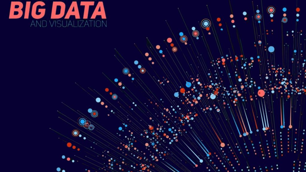
- Scalability and Performance: Visualization tools will need to handle increasingly large and complex datasets, leveraging distributed computing and parallel processing techniques to ensure scalability and performance.
- Real-Time Analytics: Real-time visualization capabilities will become essential for monitoring and analyzing streaming data sources, such as IoT devices, social media feeds, and financial markets, enabling timely decision-making and response.
- Temporal and Spatial Analysis: Visualizations will incorporate advanced temporal and spatial analysis techniques to uncover patterns and trends in time-series data and geospatial datasets, facilitating predictive analytics and situational awareness.
Conclusion
Recap of key points
- Communication: Data visualization is a powerful means of communicating complex information clearly and concisely, making it easier for stakeholders to understand and interpret data.
- Insight Generation: Visual representations of data enable users to uncover patterns, trends, and relationships that may not be apparent from raw data alone, facilitating insights and decision-making.
- Decision Support: By providing a visual context for data analysis, data visualization assists in making informed decisions based on evidence and analysis, whether in business, science, or other fields.
- User Engagement: Interactive and visually appealing visualizations engage users more effectively, encouraging exploration and fostering a deeper understanding of the data.
- Storytelling: Data visualization can be used to tell compelling stories about the data, guiding viewers through a narrative that highlights key findings and insights.
- Accessibility: Effective data visualization techniques ensure that information is accessible to a wide range of audiences, including those with varying levels of expertise or sensory abilities.
- Continuous Improvement: Data visualization is an iterative process that involves refining visualizations based on feedback, new data, and changing requirements to enhance their effectiveness over time.
Overall, data visualization serves as a bridge between data and decision-makers, helping to unlock the value of data by transforming it into actionable insights that drive positive outcomes.
Future directions and trends in data visualization:
Future directions and trends in data visualization are likely to be influenced by advancements in technology, changing user needs, and a growing focus on data-driven decision-making. Some key trends and potential developments in data visualization include:
- Interactive and Dynamic Visualizations: There is a shift towards more interactive and dynamic visualizations that allow users to explore data in real-time, interact with different elements, and personalize their viewing experience.
- Augmented and Virtual Reality: Emerging technologies like augmented reality (AR) and virtual reality (VR) are expected to play a more significant role in data visualization, offering immersive and engaging ways to interact with and visualize data.
- Artificial Intelligence and Machine Learning: Integration of AI and machine learning algorithms into data visualization tools can help automate insights generation, enhance predictive analytics, and provide more personalized visualizations based on user behavior and preferences.
- Big Data Visualization: With the increasing volume and complexity of big data, there is a growing demand for tools and techniques that can effectively visualize and make sense of massive datasets, such as streaming data and IoT data.
- Storytelling with Data: Data storytelling techniques, which involve using data visualizations to tell compelling and coherent narratives, are likely to become more prevalent as organizations seek to communicate insights in a more impactful and persuasive manner.
- Ethical Considerations in Visualization: As data privacy and ethical concerns become more prominent, there will be a greater emphasis on developing transparent and ethical data visualization practices that prioritize user privacy and data security.
- Collaborative Visualizations: The trend toward collaborative work environments and remote work arrangements is driving the need for collaborative data visualization tools that enable teams to work together on visualizations in real time, regardless of their physical location.
- Integration with Business Intelligence (BI) Tools: Data visualization platforms are increasingly being integrated with BI tools to provide a seamless end-to-end data analytics solution, allowing users to move seamlessly from data analysis to visualization and reporting.
Overall, the future of data visualization is expected to be shaped by a combination of technological advancements, user preferences, and the evolving data landscape, with a focus on making data more accessible, actionable, and impactful for users across all industries and sectors.
Trizula Digital Solutions offers an unparalleled program tailored to empower current IT students with foundational skills in data science. Our self-paced curriculum ensures alignment with academic pursuits while preparing students to enter the job market seamlessly upon graduation. Trizula Mastery in Data Science covers essential concepts in data science, AI, ML, NLP, and more, fostering a deep understanding of contemporary technologies crucial for future career growth.
Designed for engineering students, our program emphasizes practical, industry-relevant skills that serve as a robust platform for professional advancement. With a flexible learning approach, students can master key tools and techniques at their own pace, ensuring they are job-ready in today’s competitive landscape. Don’t miss out on this opportunity to click here and embark on your journey towards mastering data science with Trizula Digital Solutions.
Data Visualization FAQ: Understanding Visual Data Analysis
1. What is the main purpose of data visualization?
The main purpose of data visualization is to present complex data in a visual format that is easy to understand and interpret. By representing data visually through graphs, charts, and other graphical elements, data visualization allows individuals to quickly grasp and comprehend large amounts of information. This can help in identifying patterns, trends, and relationships within the data, enabling more informed decision-making. Additionally, data visualization can be a powerful tool for communication, allowing stakeholders to easily grasp and engage with the insights derived from the data. Ultimately, the primary goal of data visualization is to make data more accessible, understandable, and actionable for a wide range of users, from analysts and decision-makers to the general public.
2. What are the 5 steps in data visualization?
The process of data visualization generally involves five key steps. First, it begins with identifying the purpose and audience for the visualization, which helps determine the most effective visualization methods and design choices. Second, data acquisition and preparation involves gathering and cleaning the relevant data to ensure it is accurate and suitable for visualization. The third step is selecting the appropriate visualization types, such as bar graphs, scatter plots, or heat maps, based on the nature of the data and the insights sought. Following this, the visualization is created using specialized software and tools, incorporating design principles to enhance clarity and readability. Finally, the fifth step is the interpretation and sharing of the visualized data, communicating the insights effectively to decision-makers and stakeholders. By following these five steps, data visualization can lead to meaningful insights and informed decision-making.
3. What are the five data visualization techniques?
The field of data visualization encompasses various techniques for representing data. The most commonly used data visualization techniques include:
- Charts and Graphs: This technique involves using visual elements such as bars, lines, pies, and points to represent different data points, making it easy to compare values and identify trends.
- Maps: Geographic data is often visualized using maps, which can display patterns and relationships across different geographical areas, helping to identify spatial trends and correlations.
- Infographics: Infographics combine visual elements with concise text to convey complex data in a visually engaging and easy-to-understand format, making them particularly effective for communicating key insights to broad audiences.
- Dashboards: Dashboards provide a comprehensive and interactive visualization of multiple datasets, allowing users to monitor key performance indicators and make data-driven decisions at a glance.
- Heatmaps: Heatmaps use color coding to represent the concentration or density of data points within a particular area, making it easy to identify areas of high or low activity.
4. Which tool is used for data visualization?
There are several tools available for data visualization, each offering unique features and capabilities. Some of the most widely used tools include:
- Tableau: Tableau is a popular choice for its user-friendly interface and powerful data visualization capabilities, allowing users to create interactive and visually appealing dashboards and reports.
- Microsoft Power BI: Power BI is known for its seamless integration with Microsoft products and its ability to create dynamic visualizations, making it a versatile tool for data analysis and reporting.
- QlikView/Qlik Sense: QlikView and Qlik Sense are recognized for their associative data model, which enables users to explore data relationships dynamically through intuitive visualizations.
- Google Data Studio: This tool is favored for its ability to create customizable and shareable reports and dashboards, leveraging data from various sources such as Google Analytics and Google Ads.
- Python (Matplotlib, Seaborn) and R (ggplot2): These programming languages offer powerful libraries for creating customized and advanced visualizations, making them popular choices for data scientists and analysts with programming skills.
5. What is the goal of visualization?
The goal of visualization is to present data in a visual format that is easy to understand, interpret, and derive insights from. By transforming complex datasets into charts, graphs, maps, and other visual elements, visualization helps individuals identify patterns, trends, and relationships within the data efficiently. This enables users to make data-driven decisions, communicate findings effectively, and discover actionable insights that may not be apparent from raw data alone. Ultimately, the primary objective of visualization is to enhance understanding and engagement with data, empowering users to extract valuable knowledge and drive informed decision-making across various fields and industries.

